

You Collected the Data. Now Make It Useful.
Career Services offices put tremendous effort into career outcomes data: collecting survey responses, following up with graduates, bringing together information from different sources, and cleaning and validating the results.
Too often, the finished product becomes an Excel spreadsheet on someone’s computer, a report submitted to the administration, or a PDF posted somewhere on a website.
There is nothing inherently wrong with any of those. For accreditation, NACE reporting, or other defined reporting requirements, a static report may be exactly what is needed.
But if the goal is to help students, prospective students, and their families understand where an education can lead, there is another question worth asking:
Does the way you’re presenting the data help them find what they’re looking for, ask better questions, and make more informed decisions?
Publishing career outcomes data and making career outcomes data useful aren’t necessarily the same thing.
Start with the Questions People Are Actually Asking
One report can’t be everything to everyone.
An administrator may want a high-level picture of graduate outcomes. An accreditation body may prescribe exactly what it wants reported. A college or department may want to understand the outcomes of its graduates in much greater detail.
Students and families are asking different questions.
What opportunities might this degree open up? Do graduates tend to enter the workforce or continue their education? What kinds of employers hire them? Where do they go to graduate school? What do salaries look like? How prepared did graduates feel to enter the workforce?
Most institutions have at least some of the information needed to answer these questions. The challenge is often getting it to students and families in a form they can actually use.
Sometimes the detail gets lost in university-wide averages. Other times the information exists, but a student has to contact Career Services and ask someone to run a custom report from a spreadsheet or internal reporting system.
Either way, the result is similar. Career outcomes information is only useful to students and families if they can access it and understand what it is telling them.
Consider the difference between university-wide and major-level outcomes.
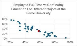 At one institution we work with, 58% of graduates overall are employed full time and 31% are continuing their education. Publishing those numbers paints one picture of what graduates do after leaving the institution.
At the major level, however, the picture can look very different. Looking across all of the majors makes the point clear: the overall numbers represent programs with very different patterns of employment and continuing education.
The university-wide numbers aren’t wrong. In fact, they may be exactly what an administrator needs.
But they don’t necessarily answer the question a student is asking.
The more specific the question, the more important that level of detail becomes.
If I’m considering a particular major at a particular university, seeing what recent graduates from that program actually went on to do gives me a more relevant starting point than a national or regional average, or even a university-wide number.
Maybe the information confirms what I expected. Maybe it raises a question I hadn’t thought to ask or makes me want to learn more about internships, graduate school, employers, or where graduates are finding opportunities.
Good career outcomes data doesn’t make those decisions for students.
It helps them ask better questions before they make them.
Make the Data Easy to Understand, and Easy to Find
This is where an interactive visualization can be particularly useful.
Tables have their place, but patterns that are difficult to recognize in rows and columns can become much easier to see when the same information is presented visually. An interactive visualization can start with the big picture and then let someone explore the information most relevant to them.
A prospective student interested in one major doesn’t necessarily need to work through pages of university-wide data. They may want to select that major and explore what recent graduates have gone on to do, including employment and continuing education, salary ranges, employers, graduate programs, geography, internships, or preparedness for the workplace.
Presented well, that information can help students see themselves in the data, compare the paths previous graduates have taken with the future they have in mind, and discover questions they may not have thought to ask.
But interactivity by itself isn’t the goal.
We’ve seen analytical reports capable of doing an impressive number of things that quickly become overwhelming to anyone who doesn’t spend their day working with data. More filters, charts, terminology, and options don’t necessarily make information more useful to the average user.
The objective should be enough detail to answer meaningful questions, while keeping the information simple enough for the intended audience to understand.
There are practical limitations too. Some programs may not have enough observations to display detailed results without creating privacy concerns. In other cases, combining multiple years may provide a more representative picture. For salary data, showing the distribution or quartiles can provide considerably more context than a single average. Those decisions should depend on the available data and the questions the visualization is intended to answer.
Of course, recognizing the value of a public-facing visualization and having the capacity to build one are two different things.
Career Services offices may have data spread across spreadsheets and systems that still needs to be standardized, validated, and prepared for reporting. Building the visualization itself takes additional time and expertise, and whatever is created has to be maintained as new outcomes data comes in. For an already-busy office, those are real constraints.
And even the best-designed visualization accomplishes very little if nobody can find it.
If students, parents, faculty, or others have to contact Career Services every time they want to explore the data, Career Services becomes the human interface to information it has already spent considerable time collecting.
There will always be questions where a conversation with a Career Services professional is valuable. But staff time is better spent on the questions that require their experience and judgment than repeatedly running reports people could reasonably explore on their own.
Making the information widely accessible doesn’t replace those conversations. It can make the conversations better because students can arrive with more context and better questions.
If the goal is for people to use career outcomes information, making it easy to find matters just as much as making it easy to understand.
Let Colleges and Departments See Themselves in the Data
There is another, less obvious benefit to making career outcomes data easier to see, and it is one we’ve observed repeatedly when working with colleges and universities.
It can improve the data itself.
Career Services may ask colleges and departments for outcomes information, help contacting graduates, or assistance encouraging students to complete a survey. Those requests can easily feel like one more thing being added to an already long list of responsibilities.
We’ve found the conversation changes significantly when people can actually see the results.
A spreadsheet may contain all of the information, but it can take considerable effort to understand what it is saying. When a college or department sees a visualization showing its majors and its graduates, the information becomes tangible.
And people start asking questions.
Sometimes a result doesn’t match what they expected. That doesn’t necessarily mean the data is incorrect. Instead, someone may recognize that part of the picture is missing.
With one client, after a visualization was finalized, a college noticed errors in its own data. Staff went back, found the correct information, and sent it in to be corrected.
In another case, a Career Services office was preparing a final report when it noticed a significant gap in one college’s data. That led to a conversation with the college, which pointed to another source of information that filled the hole.
Those conversations have helped Career Services offices catch errors and identify additional sources of outcomes information that might not have surfaced otherwise.
They can also change how colleges and departments think about the collection process itself. Seeing the finished information can make the value of Career Services’ work more tangible. Once people see what happens to the data and how it can benefit their students, they have more reason to participate in making it better.
That might mean sharing data they already collect, incorporating an existing outcomes survey into a senior-level class, or simply telling graduating students why an upcoming survey matters. Making the results visible can help people recognize how information and processes they already have could contribute to a more complete picture.
The visualization is useful not because it is interactive or visually impressive. Its value comes from what it enables: conversations, questions, decisions, and improvements that may not have happened while the information was sitting in a spreadsheet.
Don’t Be Afraid of What the Data Shows
Making outcomes information easier to explore also means making differences more visible.
Some majors will have higher salaries than others. Some will send a much larger percentage of graduates into continuing education. Some results may look different from what people expected. And sometimes the available data will simply have holes.
That is part of telling the real story.
Career outcomes reporting shouldn’t be an exercise in finding the most flattering number available. Students and families are making important decisions, and trust comes from presenting the information as accurately as possible while being clear about its limitations.
That means considering response rates and sample sizes, protecting graduate privacy, identifying where information is incomplete, and avoiding conclusions the data doesn’t support.
It also means looking beyond salary.
Salary is important to many students and families, but the value of an education can’t be reduced to a single return-on-investment calculation. Employment, continuing education, employers, graduate programs, geography, internships, preparedness, and other information an institution collects can all help provide a richer picture of where graduates go and how their education connects to what comes next.
Sometimes an unexpected result is one of the most useful things the data can produce because it creates a better question.
The point isn’t to make the data answer every question. Good information often does something more valuable: it helps people figure out which questions they should be asking.
For students and families, those questions can lead to more informed decisions. For colleges and departments, they can reveal information that hasn’t made its way into the outcomes dataset. For Career Services, they can identify opportunities to improve the information over time.
The value of a career outcomes visualization isn’t the visualization itself. It’s what becomes possible when people can see and understand the information.
Better questions. Better conversations. Better-informed decisions. And, over time, better data.
Many of the ideas discussed here, including how we approach visualization, are incorporated into the COutcomes platform. If you’re exploring ways to make your career outcomes data more accessible, we’d be happy to share what we’ve learned.
About the Author
Mark Fischer is the founder of COutcomes. For more than two decades, he has worked with colleges and universities to improve career outcomes reporting by increasing response rates, identifying additional sources of outcomes data, simplifying data collection, and helping institutions communicate the success of their graduates.